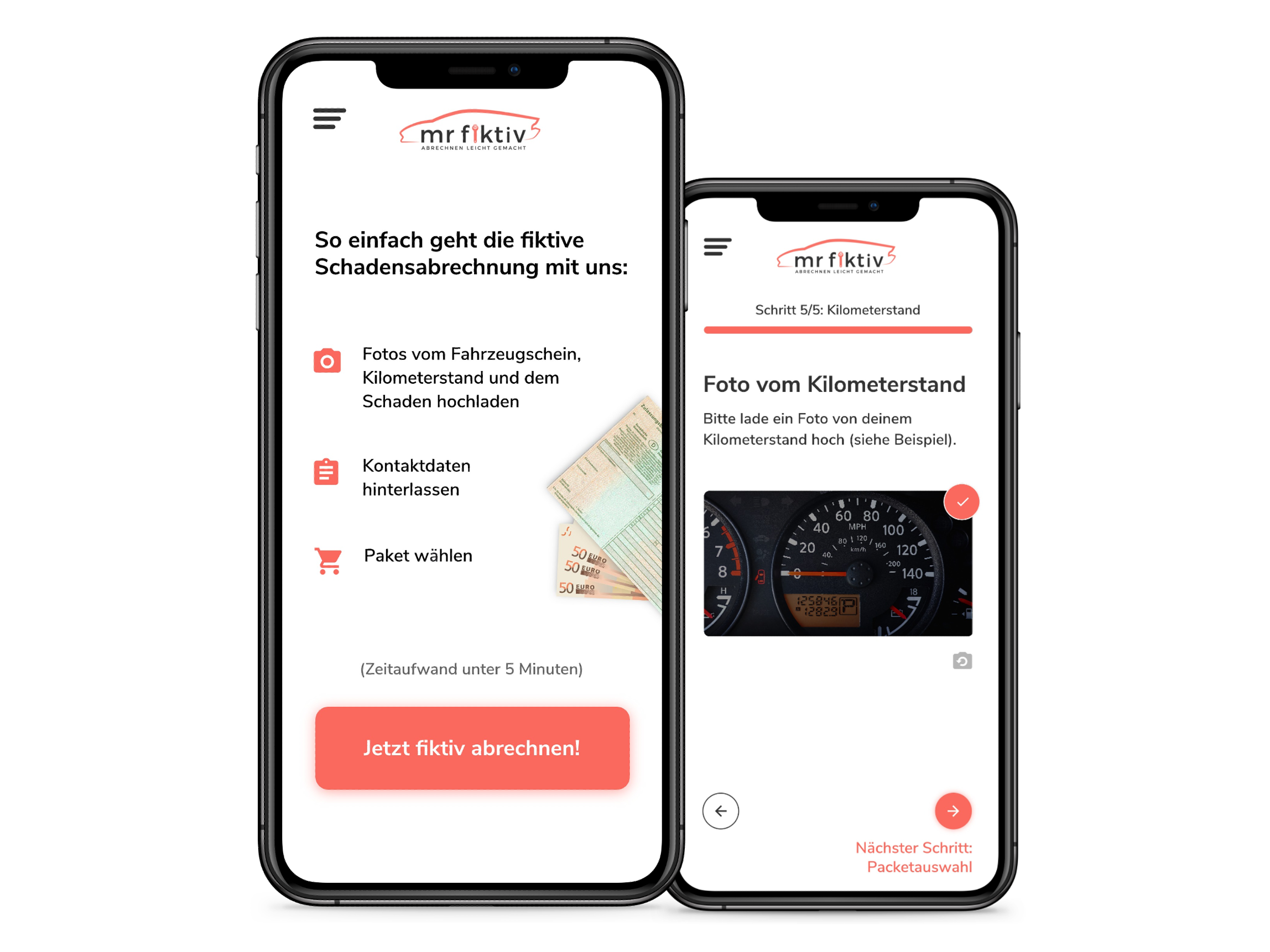
Diame
A website that lets you build custom diamond rings.
Problem
Most people don't know a lot about the 4Cs - cut, clarity, carat and color, when buying diamond rings. They spent hours searching and often overpaying for what they don't need.
I first encountered this problem when my friend told me how she and her fiancé spent hours choosing among options without knowing much about diamonds and rings.
Research process
I went online and searched for a diamond ring I would want to get for my engagement. I was immediately flooded by options, unfamiliar terminology like "gurdle" and "culet", colors like J, G, I, etc, and clarity like VS1 or IF. I was lost and curious whether others had a similar experience.
Survey
Do the users know what they need? I put this and three other questions in a survey (Google Survey Answers) and sent it out to 24 married and engaged couples:
Q: Do people know what they want when they search for a ring or do they pick the best option among the existing ones?
50% know exactly what they want
50% pick the best option
Q: How much do they know about cut, clarity, carat, and diamond color?
37.5 % don't know much
29.2% know a little about each
Q: How much time do they spend on picking a ring?
50% don't remember or didn't choose it
Q: What's important to them when they buy a ring online (multiple answers)?
79.2% care about a warranty, a money-back guarantee, free shipping, etc.
75% need to trust the company
62.5% need many explanations (e.g. what are carat weights?)
Business goals
• Selling their rings
• Earning an extremely good reputation
• Being trusted by their customers
Customer needs based on survey
Listed in order of importance:
• Money-back guarantee, warranty, free shipping, etc.
• Trusting the company
• Many explanations
• Build a custom ring
• Online consultation available
• Trusting the company
• Many explanations
• Build a custom ring
• Online consultation available
Low Fidelity Sketches
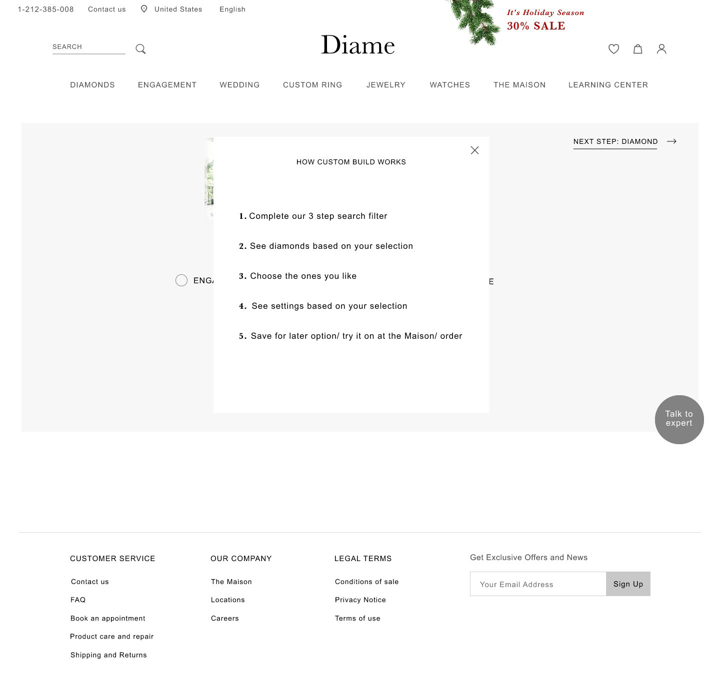
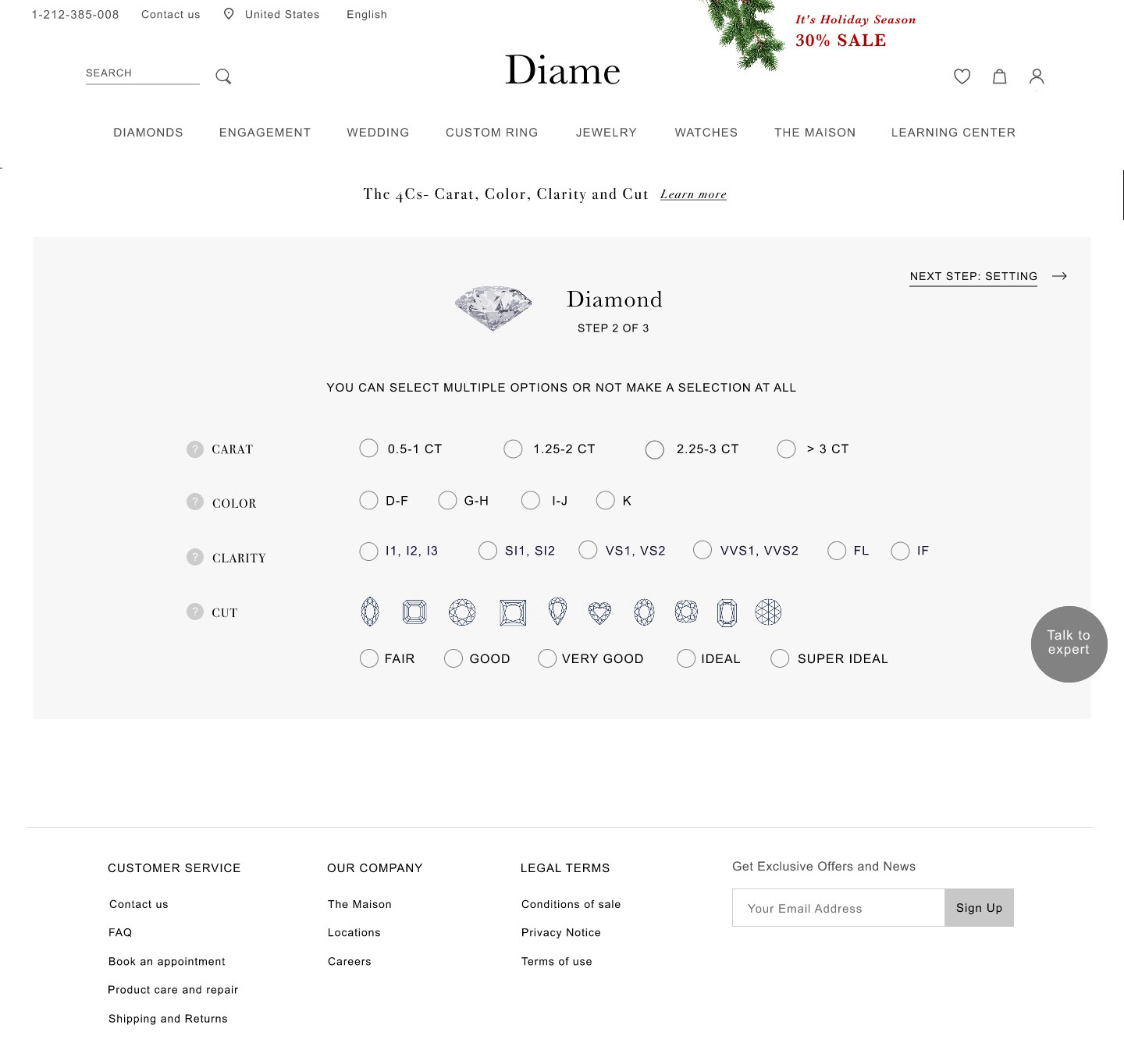
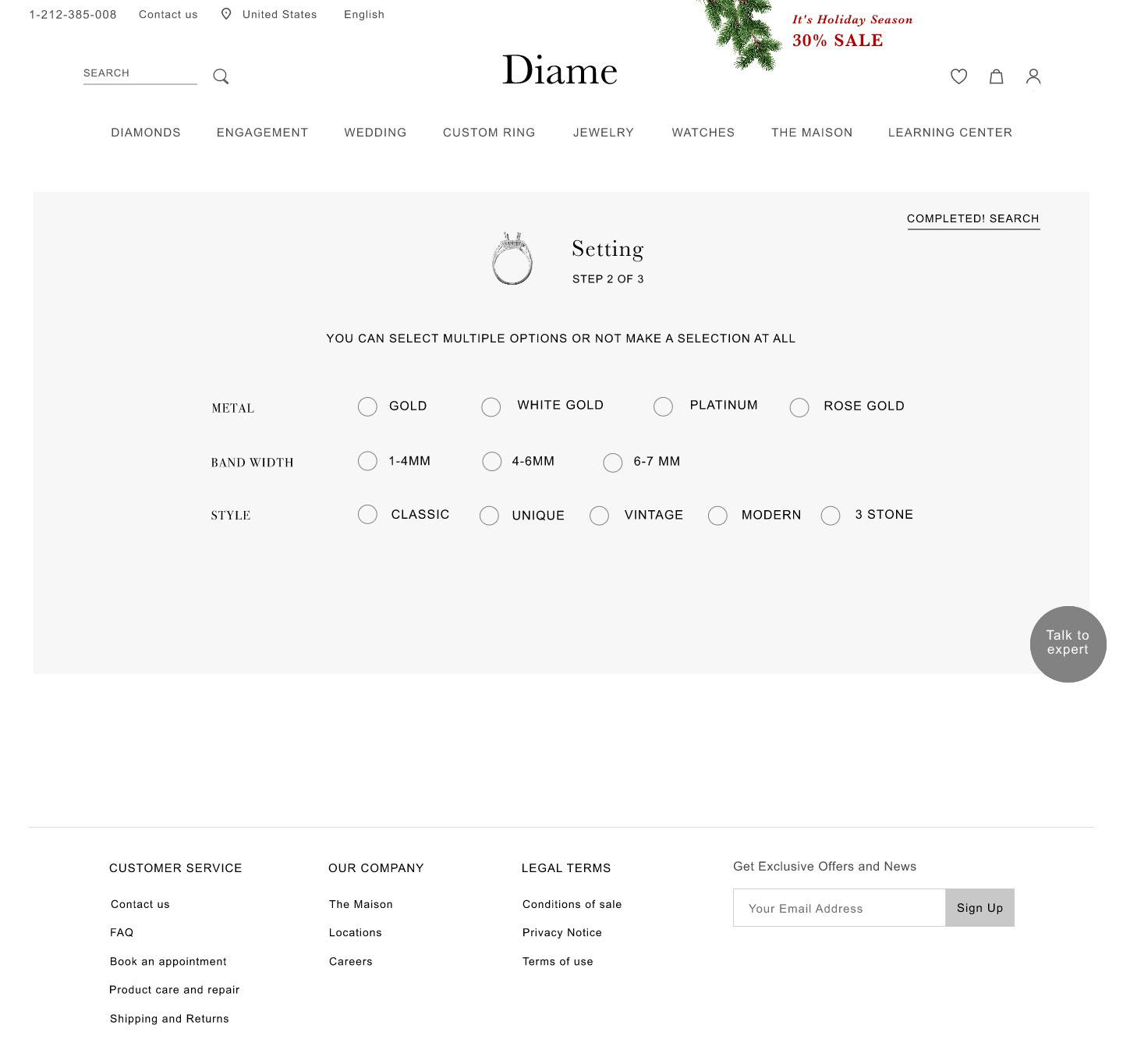
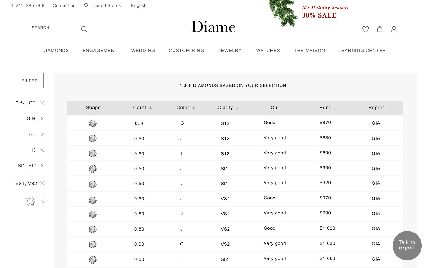
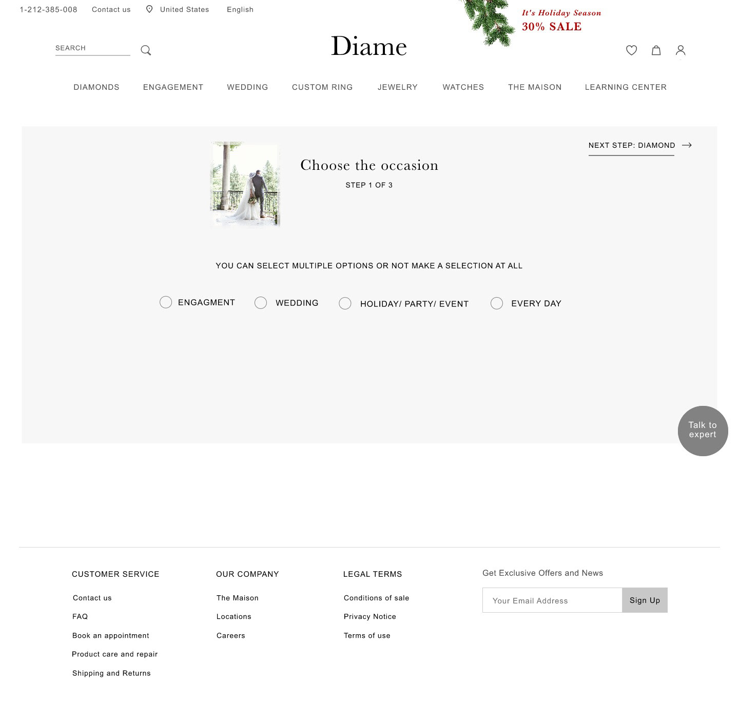
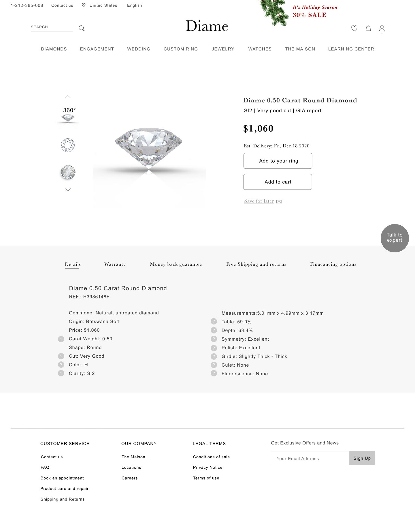
To enable the 50% (theoretical users who know what they are looking for) to find the right ring, without being flooded by irrelevant options, I designed a custom ring search functionality. For that I used paper prototypes, transferred them to Adobe XD and proceeded to testing.
Competitive Analysis and UI Inspiration
I had previously looked at the competition while doing research, but now the goal was to analyze and compare the styling. Blue Nile (upper left), one of the few websites that offered a custom ring build option, had a very minimalistic clean styling. David S. Diamond's website caught the user's attention by showing big images of the product. Tiffany and Cartier both had a very clean, elegant style, that hinted to the brands' good quality. All websites used a white background to direct the attention to the rings and diamonds, used one action color, and a black font color.
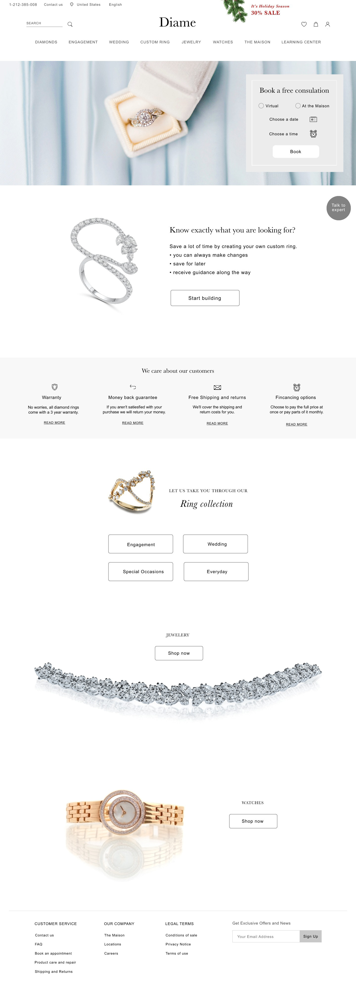
Result
(click (+) twice for a full zoom in)
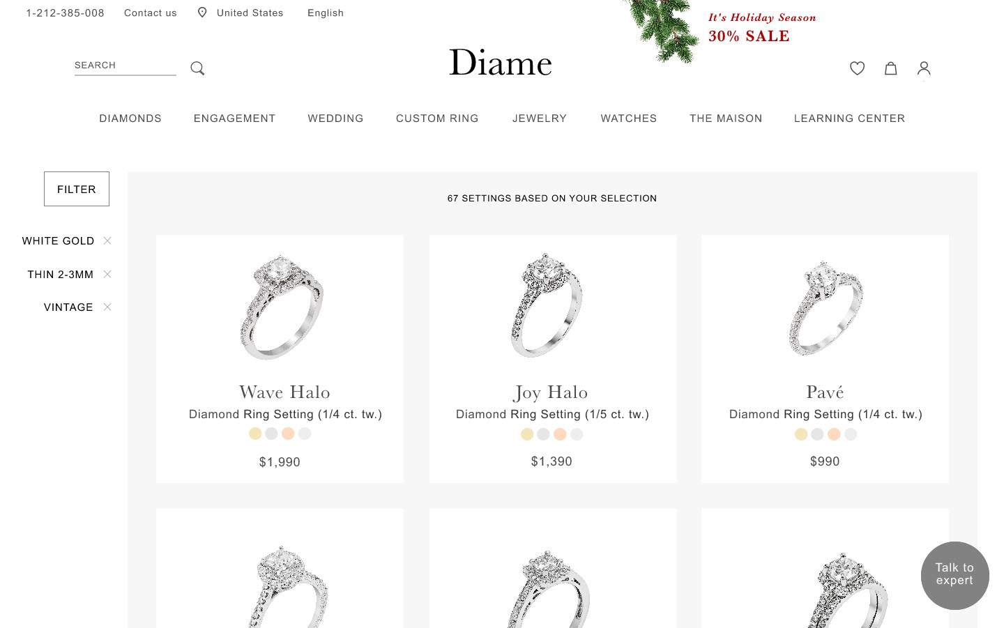
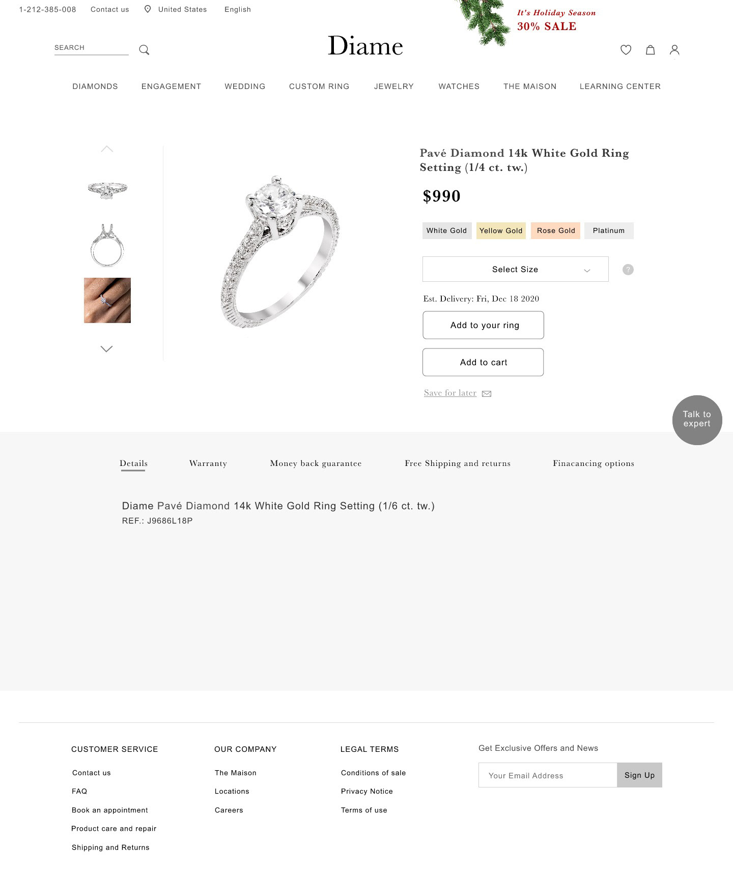
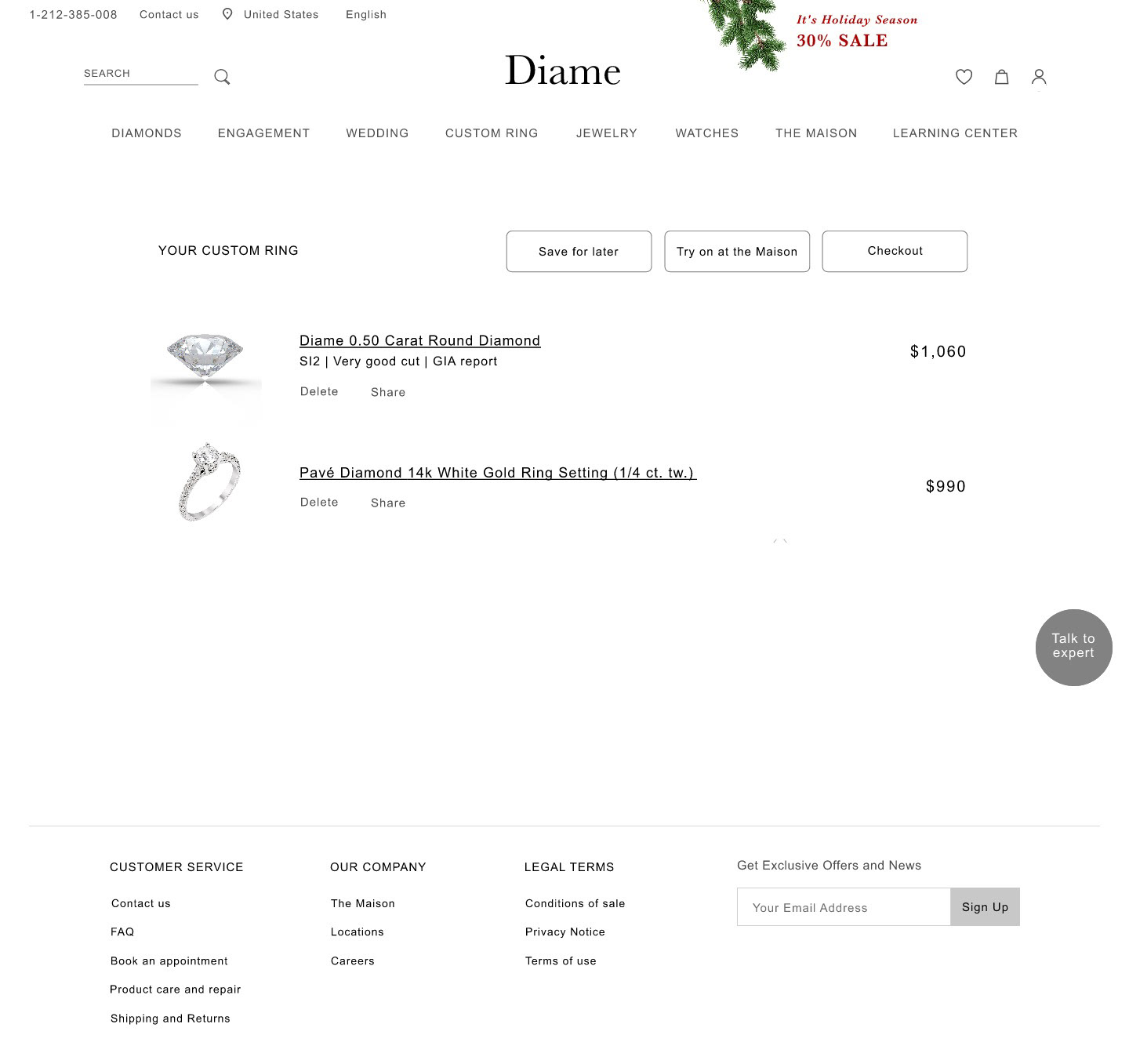
First Click Testing
My testers were two female friends who frequently shop online for jewelry. I sat down with each and presented them with a clickable wireframe and observed where they would click and how long it took them to make a decision. I took notes of their facial expressions and reactions to the different screens.
The goal was to answer the following questions:
1. Which buttons, content, language, and other navigational elements are intuitive?
2. What did they notice, misuse, or avoid altogether?
3. Where is the best place to put buttons, shopping cart icons, menus, and other navigational elements?
Based on the responses and reactions, I ended up changing the layout of the custom search, otherwise they found the designs intuitive.
What I learned
I learned how important research is and that it's impossible to guess what people will think or do. I also learned that trust plays a huge role when shopping online, especially when it comes to spending a lot of money.
